Cirfood - Qubì - The digital innovation of in-company food service

Think - Create

A mobile application and smart locker that revolutionizes the office lunch break.

  • Services

    UI Design
    Product Design
    Experience Mapping
    Design Thinking

  • Areas

    Food Services

Qubì is Cirfood’s new digital formula for lunch breaks for all those businesses that do not have an in-house cafeteria.

Together with the technology partner Mia-Platform, we helped Cirfood develop from scratch this innovative solution, which allows its users to order via app the dishes for their lunch break and pick up the order at the appointed time directly from a locker located in the company.

About Cirfood

Cirfood is one of the largest Italian companies in the field of organized, commercial and collective food service and business services. The company has more than 15,000 employees and produces more than 100 million meals each year for schools, companies, hospitals, retirement homes and public establishments. Always focused on the constant innovation of its services, Cirfood decided to rethink the lunch break for offices that do not have a cafeteria available, and asked Mia Platform and Thanks Design to design this new digital solution together.

A lean startup approach

The design of the new service was carried out with a startup mindset. The goal was to develop and test the new solution as soon as possible with end-users. Thanks to a cross-functional team, in a single month we defined, the vision, the journeys and the service, synthesizing everything into a customer journey map and a corresponding service blueprint.

After that, we hypothesized and validated the interface through wireframes, and then proceeded in parallel with Mia-Platform developers in UI design and development. To tell the story of the service, recipes, and ingredients, we decided to create a set of animated illustrations and ad hoc iconography, which accompanied the user through every moment of the journey, starting with onboarding.

The journeys that required the most attention were those from ordering the dish to picking it up at the locker at the appointed time. It was a matter of finding the right balance between a flexible user experience and the possibilities given by the operation of the locker and smart fridges.

A new identity for Qubì

A new brand identity, different from Cirfood’s, had been created for Qubì. We started from that to create a visual design for the app that was fresh and oriented to enhance the culinary offerings.
As with any product in the food business, the value of images played a key role. Users needed to be able to touch with their eyes the quality and goodness of the dishes on offer, and we needed to find a stylistic form to uniformly represent different recipes and products: from pasta with carbonara sauce, to a rice bar.

Iconography and illustration set

To tell the story of the service, recipes, and ingredients, we decided to create a set of animated illustrations and ad hoc iconography, which accompanied the user at every moment of the journey, starting from onboarding.

The impact of our work

  • 4 Months to release the first MVP, ready to be tested on a sample of offices
  • 1 New format redefining the concept of corporate catering through the combination of mobile app and smart locker
  • 4 Months of time to market
  • 1 Month from brief to UX validation
projects
Find out how we work
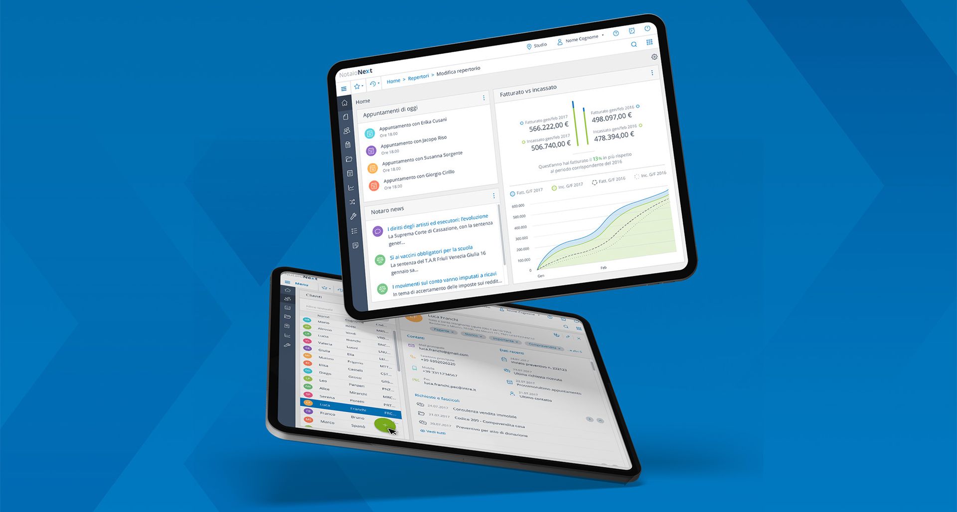
Wolters Kluwer Italia - NotaioNext Redesigning the most widely used digital suite for Italian notaries

Think - Narrate - Create

Find out more
Cattolica Assicurazioni - Quotti B2B Proposals and insurance policies. Easy and everywhere

Quotti B2B facilitates agents' activities and monitors their progress in real time.

Think - Create

Find out more
Get in touch

Let's design your next project together